Lapa Solar
Expanding an existing company with a new logo and brand guideline.
Challenge: Creating a new logo while staying consistent with existing company guidelines.
Process: Created a mood board of client goals. Pulled colors from existing brand and created new logo. Met with client during multiple phases of logo creation. After confirmation of new logo and then moved onto printed and web collateral.

Lapa Solar — Brand Identity & Marketing Collateral
This project involved creating a cohesive visual identity for Lapa Solar, a renewable energy company rooted in Costa Rica’s natural landscape. The work included logo design, brand guidelines, a sales one-pager, and a business card system—each element designed to communicate clarity, trust, and sustainability.
The identity draws inspiration from the lapa (scarlet macaw) and the sun, blending vibrant color with clean, modern typography to reflect both energy and reliability. The result is a flexible, professional brand system that works seamlessly across print and digital touchpoints while positioning Lapa Solar as a confident, forward-thinking leader in solar energy.
New Logo - Lapa Solar
The Lapa Solar logo is inspired by the scarlet macaw (lapa) and the sun—two powerful symbols of Costa Rica’s natural energy and biodiversity. The mark combines organic forms with a modern, geometric structure to convey movement, reliability, and renewable power.
Designed to be versatile and instantly recognizable, the logo works across digital and print applications, maintaining clarity and impact at any scale while reinforcing Lapa Solar’s connection to nature, sustainability, and forward-thinking energy solutions.

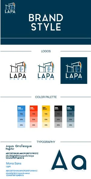
Existing Logo and Brand Guidelines - Lapa Homes

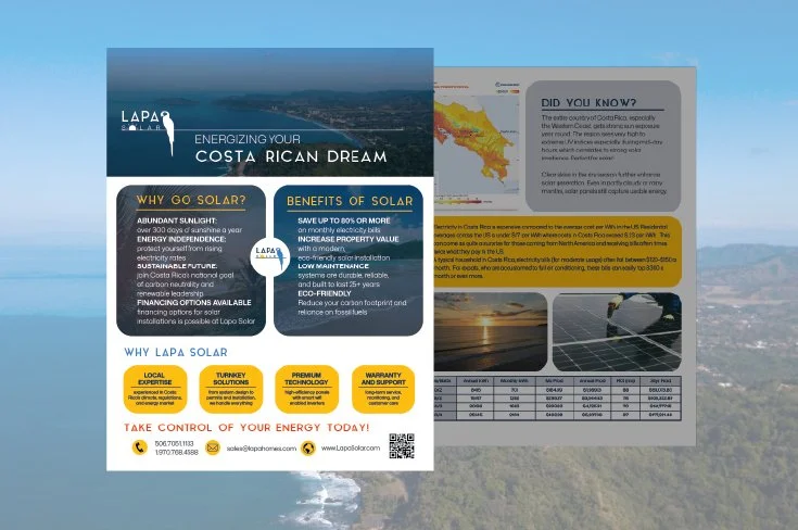
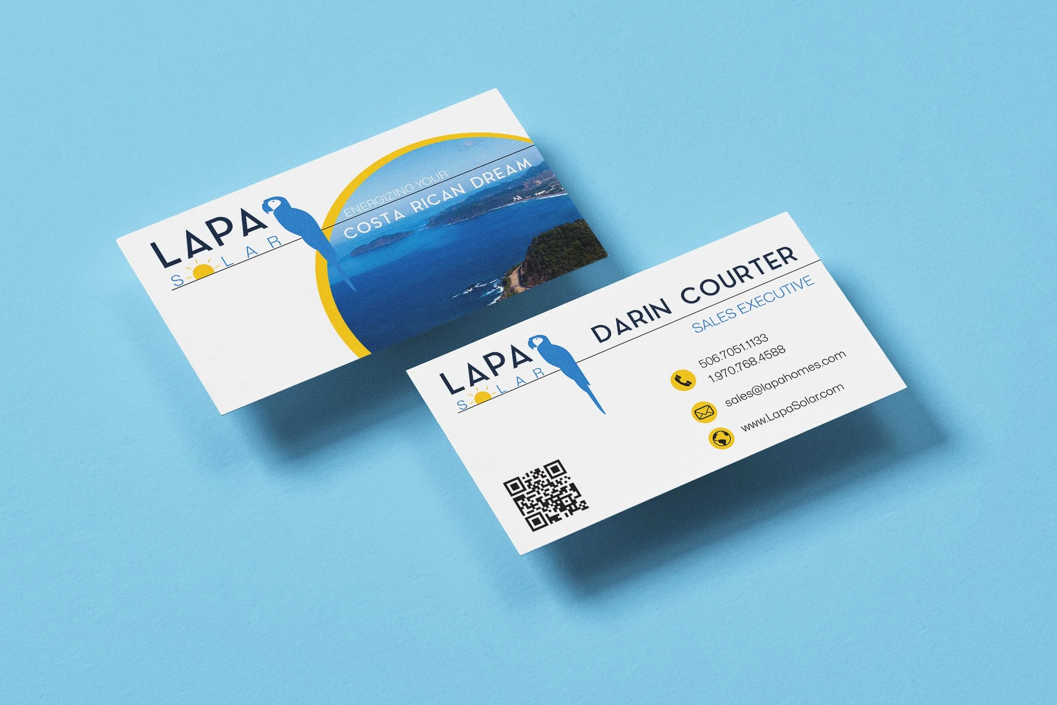
Sales One-Pager & Business Card
The sales one-pager was designed to clearly communicate Lapa Solar’s value proposition at a glance—highlighting solar benefits, local expertise, and an easy path to action. Clean layouts, bold iconography, and strong hierarchy ensure the information is approachable, persuasive, and easy to digest.
The business card extend the brand into a tactile format, balancing simplicity and confidence. Strong color use, thoughtful spacing, and consistent typography reinforce brand recognition while maintaining a professional, modern feel suitable for client meetings and partnerships.